![Flatten the Curve [Image Dr Siouxsie Wiles et al] 2](https://www.universitycitynews.org/wp-content/uploads/2020/03/Flatten-the-Curve-Image-Dr-Siouxsie-Wiles-et-al-2-678x381.jpg)
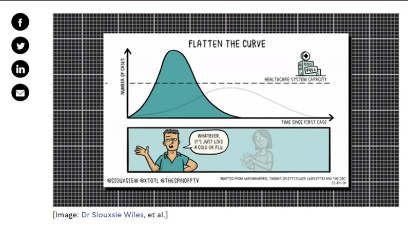
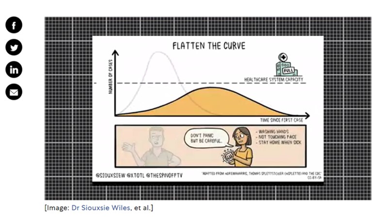
The story behind ‘flattening the curve,’ the defining chart of the coronavirus; as published by Mark Wilson, Fast Company on March 13, 2020 : With roots that trace as far back as a 2007 paper published by the CDC, the core scheme of Flatten the Curve is an idea that’s been repeatedly remixed by health experts to reach its final, clearest form, proposed by New Zealand microbiologist Siouxsie Wiles and drawn by illustrator Toby Morris. It toggles between two potential futures for our healthcare system.
- In the first, a man dismissively says “whatever, it’s just like a cold or flu,” and above him, we see a large spike in the number of coronavirus cases, peaking well above a dotted line conveying healthcare capacity.
- In the second, it toggles to another perspective, a woman washing her hands saying, “don’t panic but be careful,” and we see the number of cases smoothed to a long, low hill that doesn’t overwhelm our hospital system.
The idea behind Flatten the Curve is simple: Taking steps like washing your hands and staying home if you’re sick [and maintaining social distancing to reduce exposure] can slow down new cases of illness, so that the finite resources of our healthcare system can handle a more steady flow of sick patients rather than a sudden deluge.
That’s a excerpt from the article; to read the entire article and to view the animated gif, visit https://www.fastcompany.com/90476143/the-story-behind-flatten-the-curve-the-defining-chart-of-the-coronavirus
For related posts from UCCA, visit https://www.universitycitynews.org/category/community-health/


